
- This leeds Festival logo is simple and effective.
- It only uses 3 different colours.
- It has a simple legible font.
- Easily recognizable,
- Adaptable (Can be manipulated slightly so it can be slightly different for the following year),
- "Download" is in an usual yet simple/legible font.
- 3 people with different and defined colours.
- Simple illustration of people.
- "Glastonbury" is in an usual font.
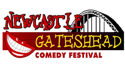
- The use of the bridge, referencing the local area
- The grin = comedy, (simple)
- 3 different fonts used.
- The V used is clear and noticeable to the Virgin company logo.
- Simple,
- Nice font.

- It is clear that there is a castle in the back ground, and it is silhouetted.
- The use of colours,
- The stencil font used, is bold and noticeable.
- People playing instruments on the logo.
- Clear to see it is a music festival that is set at the coast. Due to the sailor tattoo references.
- Tattoo.... I love the vintage tattoo designs.
- Minimal colours
- The use of bright vibrant colours.
- Different fonts.
- Use of location in the logo.
From these examples, I can tell that I need to create a logo that uses the following traits,
- Simple,
- Uses imagery from the local area,
- Bold fonts,
- Choose colours carefully
- Create it so it could be slightly manipulated for the following year.
No comments:
Post a Comment