First Logo Idea,
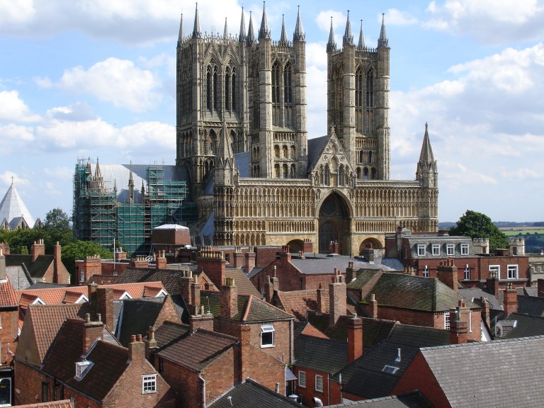
I have an idea about creating sound waves and using the Cathedral,
1) Using the Cathedral,
2)

By cutting around the cathedral and then filling it in with the colour blue, I was left with this,
3)
By flipping over the black one and then placing it directly under the other cathedral it looks similar to sound waves if you don't concentrate on it. I attempted to try using one colour for the whole design ...
But I didn't think it works very well. Over all I like this idea. It is what I am looking for, simple, effective and could be manipulated for further use later years
--------
Second Logo Idea,
I want to try and incorporate a coat-of-arms in the logo design process, I want to see if I can put a modern take on an old art form,
By taking a coat of arms off of
www.google.com I attempted to look for one that's center mainly consisted of blue and green and then used Illustrator to try and make it less detailed.
I gave up on the coat-of-arms idea very early, even though I felt like it had potential. The coat-of-arms was incredibly detailed and I didn't feel comfortable going down that path. I want to create something simple and effective and not ruin heraldry.
--------
Third Logo Idea,
For this idea I thought I would take an already popular logo and attempt to redesign it for this festival,
For this I changed the font of the logo and the NY to LN. The reason why it's LN is because that is the Lincoln post code and everyone in Lincoln (should) know that.
I attempted to use a grubby type writer font instead of using a traditional clean cut font. This will allow this logo to be manipulated for later years.
After putting the logo through illustrator I was able to smooth it out and make it look nice. I really like this logo, it fits a lot of my criteria.
--------
Forth Logo Idea,
For this idea, I thought I would try and incorporate the Lincoln Imp with a few ideas.
First a picture of the Lincoln Imp is

I then put it in illustrator and used Live Trace and I was left with this image. I like this image, but I thought I would attempt to explore this,
I thought I would attempt to tract the image by hand and then surround it with "Lincolns Festival of Music". I like the idea, but I don't like the hand drawn imp in the middle and the font is not very original.

I thought I would fill in the previous image then attempt to do something similar to the iPod posters.... I don't like it, it doesn't look professional at all.
After that Idea, I inverted the colours and edited the imp so the leg was more visible instead of it looking like he has one think leg.

I really like this image!!!! Its new and different, but the only problem I can think of is that it doesn't have any letters/words with it. I don't know if i can get away without using words, but i think it looks better without.
After that, I came across a picture of Skull and Crossbones, and I thought that it was pretty rock and roll, so I thought I would attempt to edit the imp to look like it.
I took the head off of the previous image and inverted it, and then I went on google.com and looked up two long familiarization instruments, a guitar and a trombone. I also wanted the two different interments to coincide with one another for two different types of music, classical, and jazz with the trombone and rock and roll with the guitar.
I really like this image !!!!!! I think it works on a few levels and it is very simple as well :)
--------
Fifth and Final Logo Idea,
I would have liked to try and incorporated a pub sign post into a logo, I found this pub sign post on google Images. and then I attempted to manipulate it.
I applied a view of the Lincoln Cathedral to the main image and then edited the text around it. I like it to a certain extent, but I don't think it would look professional if I carried on with it.